Branding, WordPress design, and Ecommerce
for an urban-euro cafe in downtown Ventura
Branding, WordPress design, and Ecommerce for an urban-euro cafe in downtown Ventura
We recently completed a project for a new client. Palermo is an urban-euro cafe in Ventura, CA. They offer a unique atmosphere in downtown Ventura, and they’ve attracted a customer base of regular locals, and tourists exploring Ventura, since 2001. They have locally roasted coffee and loose tea, 18 flavors of gelato, gourmet chocolates and truffles, locally baked pastries and deserts, and a gift boutique with unique, hard-to-find items.
In nearly 20 years, they never had a digital footprint that represented them well.
They are more than just a coffee shop. The owner has spent years connecting with manufacturers and suppliers of unique, tasteful, and often rare home and garden items. This boutique component of the business is popular, charming, and really makes Palermo standout.
They needed a two-part plan:
First - build a modern site to represent the cafe well online to locals.
This would include great visual design, and local SEO to help attract tourists who may not know where to go for coffee and pastries.
Second - build an online store to sell their boutique items.
This would recreate the feel of their gift shop digitally, and would allow them to sell items online and ship them to customers anywhere. Their long term goal with this is to scale up online sales, ship to customers around the US, and become a go-to resource for high quality, unique, and rare home and garden items.
The owner had been wanting to bring both of these ideas to life, and when they were forced to close for many weeks during the 2020 lockdowns, they decided to use that time wisely and build for their future.
Quick summary of services provided:
- Branding and visual design
- WordPress development
- Content direction
- Ecommerce development
- Point of Sale configuration
- Photography and imaging
Full rebranding with Branding Kit
Our branding kits are an ideal starting point that sets the foundation for a website design, and are the best way to start projects where visual design is a high priority. We worked closely with the client to create a complete company branding kit from scratch. Our branding kit is a complete guide for how to represent a company visually. It includes:
- Logo
- Logo Elements
- Moodboard
- Typeface Details
- Colors
- Social Media Layout
To marry the client’s vision with the tastes of their customers, and make it work visually in both digital and physical mediums is a delicate process.
We started by looking at their previous logo design, and we collected various other logos they can tried developing, business cards, and other materials different artists had developed for them. They didn’t have a cohesive branding across all of their items.
We discussed with them how they came to start the business. They are attracted to Italian design, hence the name - Palermo, is named after Palermo, Italy. This gave us a perfect starting point, and we decided it would make sense to go in a direction that would have an old-world sense of beauty, but also have a modern, updated, sharp and clean quality as well.
To add to the branding challenge, the boutique side of the business and the cafe side of the business differ a bit.
Key qualities - boutique side
- Home-like
- Warmth
- Charm
- Upscale
- Rustic-chic
Key qualities - cafe side
- Northern Italian
- Old world class
- Inspired by the cafes in Palermo, Italy
To make this work, it was decided that two logos were needed - one for the cafe, and one for the gift shop.
Gift shop logo icon:
Gift shop element:
Cafe logo icon:
Cafe element:

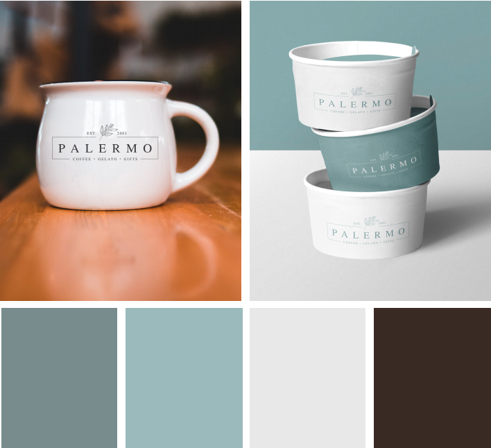
Moodboard
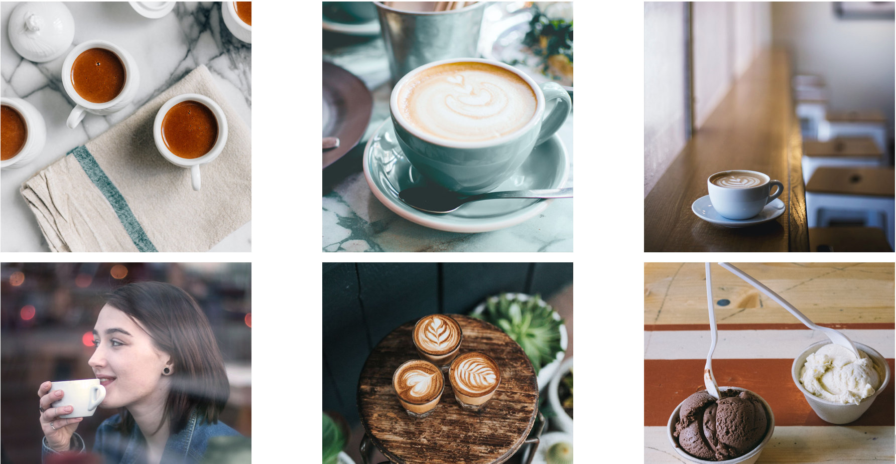
Showing how the logo can work on print items was exciting for the client, and they asked us to connect them with the supplier of these exact coffee cups and gelato disposable containers so they could buy these items as-is for their cafe.
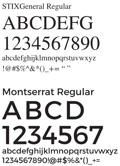
Typeface details
This specifies exactly which fonts to use for headings, body text, and all use cases across the website, social media assets, and physical items like cups, bowls, and apparel. These fonts fit the Palermo, Italy theme well, while also having great readability as website fonts, and clarity and style when applied to physical items. Montserrat is one of the most requested fonts on our design projects over the last several years.
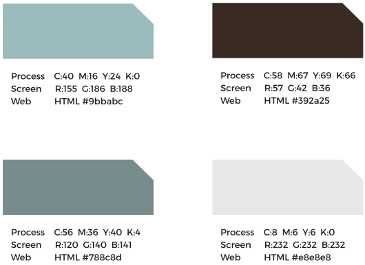
Colors
Exact colors are specified including color codes. This is important for verifying the exact same company colors are used everywhere including website, social media, and physical items.
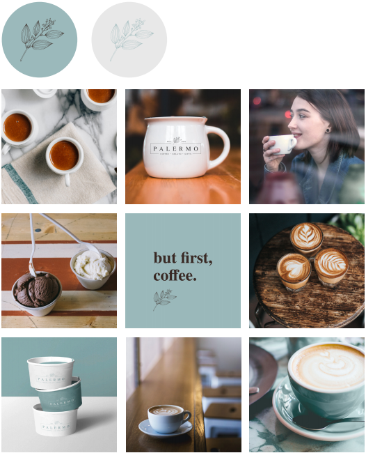
Instagram Layout Concept
WordPress Web Design with Custom Template
We created a custom WordPress template for the client’s website. We worked with the client to research and review websites they are attracted to. This process involved looking at range of websites including:
- Cafes in San Francisco, Italy, and New York City
- Home and Garden online boutiques
- Large, mainstream ecommerce sites
Starting with the Cafe site, we focused on the best elements of several sites the client was attracted to. Then, using the branding kit as a guide, we started creating a custom WordPress template that matched the branding the client was so excited about. The result was ultimately something totally unique to Palermo.
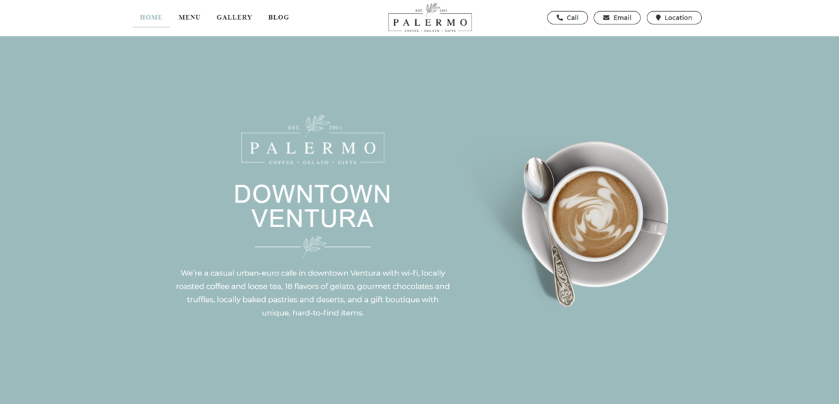
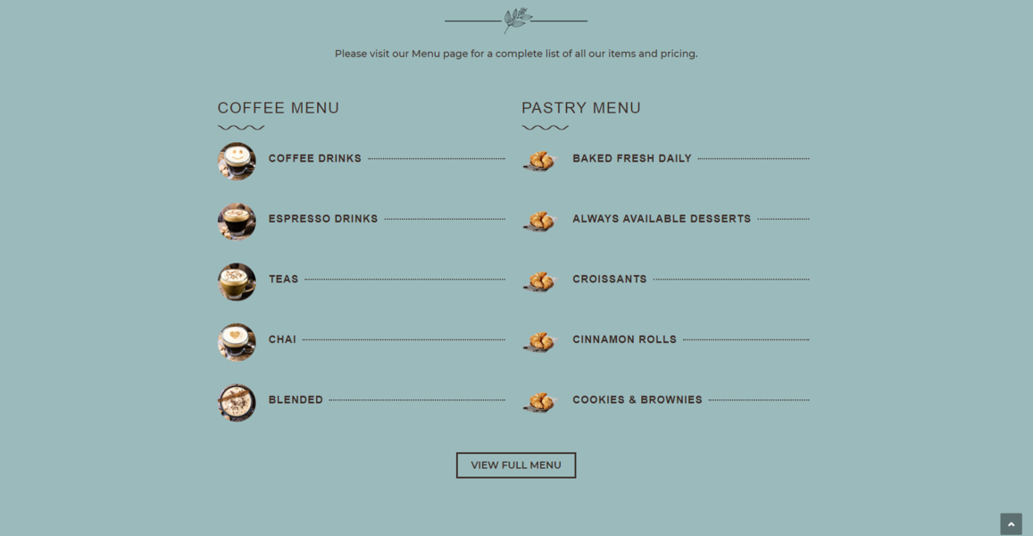
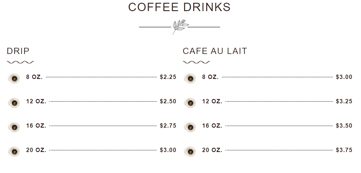
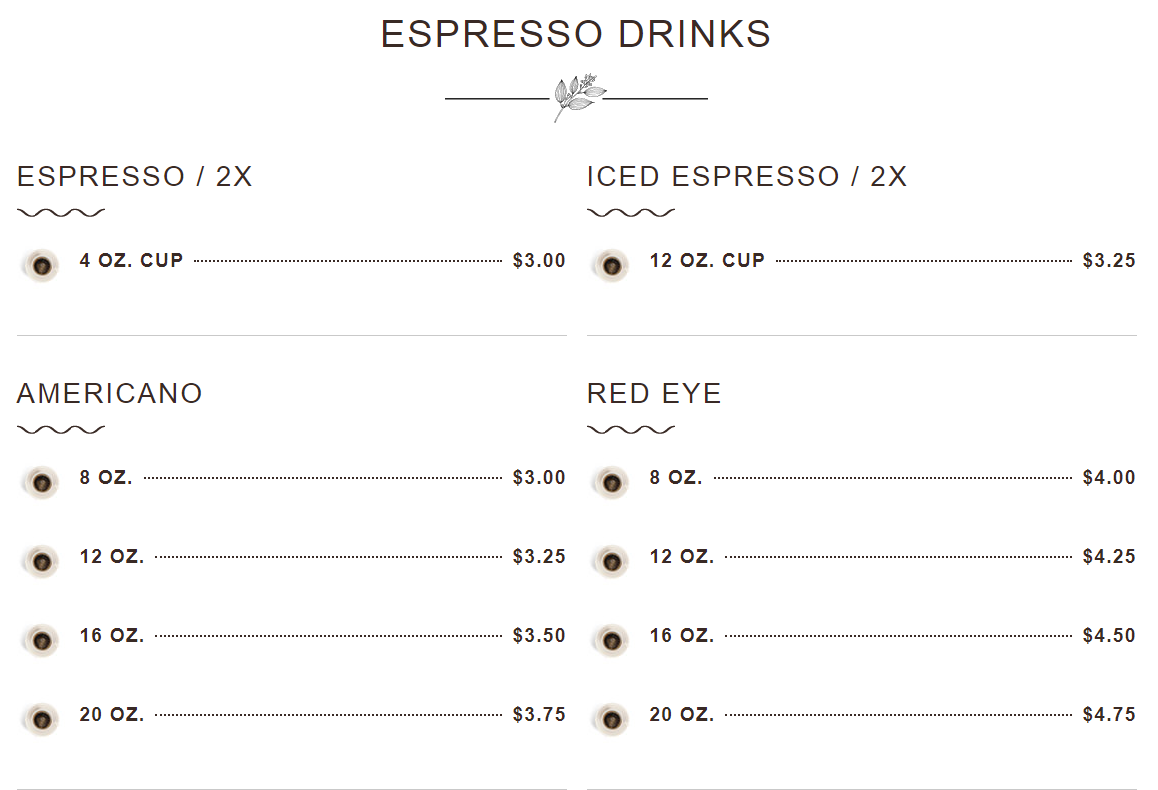
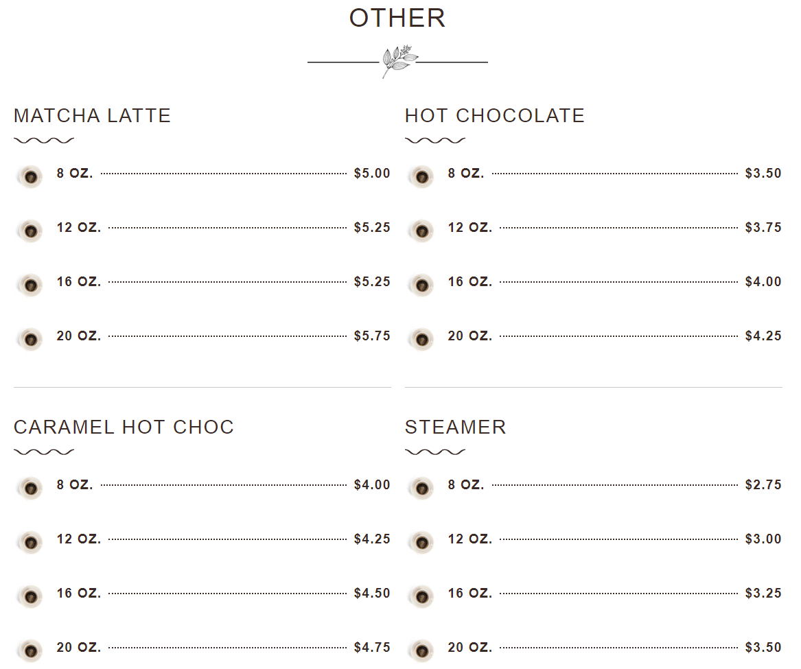
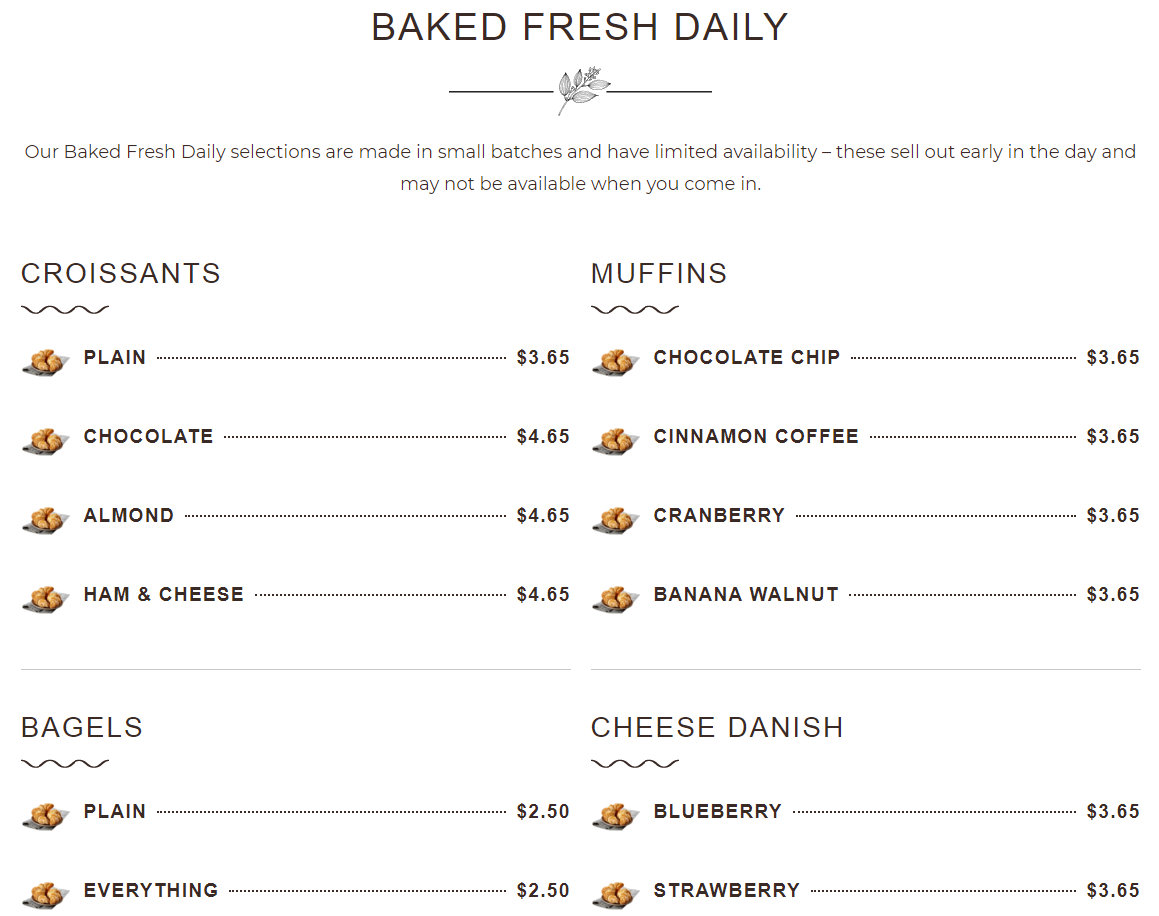
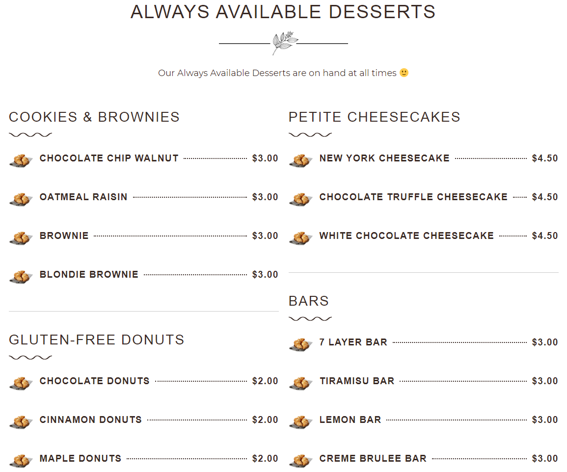
We developed initial concepts for a Home page. The Menu is obviously a big focus as well because people who have never been to Palermo may find them online, browse their menu, and if they like what they see, decide to drop in or place a to go order. We spent a lot of time perfecting the layouts, and finding a perfect balance between the large screen display for desktop and laptop computers, and the small screen display for mobile phones and tablets.
Key website elements:
Large hero image, with key contact information immediately accessible.
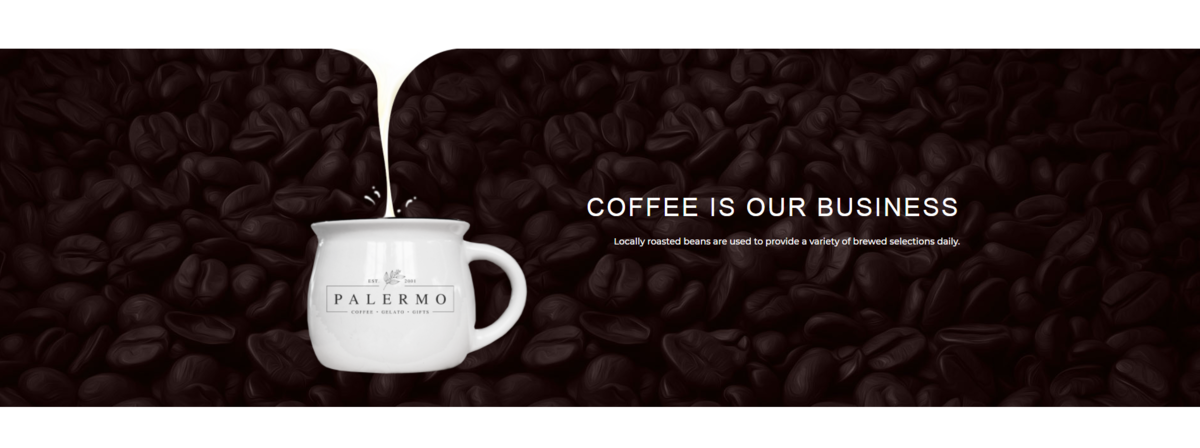
Visual flairs
Menu snapshot on homepage
Full online menu including over one hundred variations of items and sizes
See Palermo Coffee's full website:
Palermo CoffeeNext Steps
We’re working with a client to develop an Ecommerce site to sell their home and garden physical items through. They have thousands of products including furniture, candles, books, clothes, and outdoor items. This work involves:
- Importing products into their Point of Sale (POS) system
- Syncing their Point of Sale (POS) system with their Wordpress Store
- Setting up shipping protocols, refund / privacy / data policies
- Setting up payment gateways
- Setting up ways to promote the products via Facebook
- Close work on the design of the site, creating content for each page, and handling other fine details about the site