Branding, WordPress design, and SEO
for Esthetician in Ventura, CA
Branding, WordPress design, and SEO for Esthetician in Ventura, CA
We recently completed a project for a new client. Savanah Stockton is a licensed esthetician, anti aging specialist, and provider of paramedical skin care services in Ventura, CA. Between her training at the San Francisco Institute of Esthetics and Cosmetology, and her partnership with luxury skincare brand Danné Montague-King, she knew she was providing a unique level of expertise to people in the Ventura region.
She approached The Final Code about doing a complete overhaul of her company’s digital footprint.
Quick summary of services provided:
- Branding and visual design
- WordPress development
- Search Engine Optimization (SEO
- Content direction
Full rebranding with Branding Kit
Our branding kits are an ideal starting point that sets the foundation for a website design, and are the best way to start projects where visual design is a high priority. We worked closely with the client to create a complete company branding kit from scratch. Our branding kit is a complete guide for how to represent a company visually. It includes:
- Logo
- Logo Elements
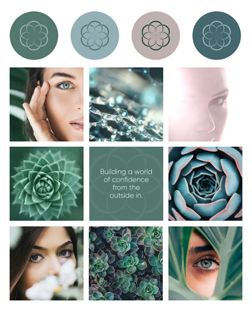
- Moodboard
- Typeface Details
- Colors
- Social Media Layout
We spoke with her about what kinds of images and themes she is attracted to. We brainstormed with her, looking at images she found inspirational, and established a general sense of the design direction for the logo.
The Flower of Life is a geometric design pattern that has inspired art, jewelry, graphics, and countless other things. The Flower of Life stood out to Savanah from a visual design perspective, and it also had meaning in terms of her skincare work, which uses a natural, holistic approach that is supported by scientific principles. Using the Flower of Life as a starting point, we had the goal of creating a logo that had depth and movement - she wanted to break away from the current trend of 2-dimensional logo design without creating a complex logo that might appear dated.
We were able to create a new design based on this classic theme that the client loved. We create numerous variations so that the client has color and design options for any application that may be needed.
Logo icon
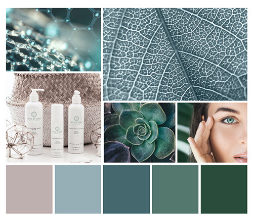
Moodboard
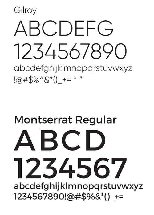
Typeface details
This specifies exactly which fonts to use for headings, body text, and all use cases across the website, social media assets, and future print and product merchandise applications.
Logo translation examples with byline and company name:
The client received 8 versions of the logo icon that are useful for social media displays like profile pics and Instagram story covers:
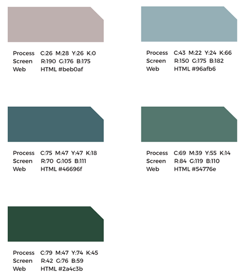
Colors
Exact colors are specified including color codes.
Instagram Layout Concept
WordPress Web Design with Custom Template
We created a custom WordPress template for the client’s website. We worked with the client to research and review the websites of other successful skincare businesses. This process involved looking at range of websites including:
- Established brands with presences in Australia and the United States
- Similar experts in New York City with strong SEO
- Completely bespoke skincare studios
There was a huge range of design philosophies between all of these companies. Some focused heavily on products in some cases. Others focused greatly on the service provider as a person. A few focused on the experience of being in the studio.
Savannah wanted to focus on providing people with information they could use to make smart decisions about how to approach caring for their skin, and how she could support them in this. This called for a new design that we were not seeing in her industry.
We came up with this philosophy for her site:
- It must be visually beautiful, and inspire confidence in new prospective clients
- It must appeal to her target client: adults who have a serious commitment to skincare and anti-aging
- It must be able to communicate nuanced information about her services in fine detail, while remaining easy to read
- It must have tasteful, sharp images that complement her philosophy on skincare and the concepts being communicated
We developed initial concepts for a Home page, and templates for her Service pages. We spent a lot of time perfecting the layouts, and finding a perfect balance between the large screen display for desktop and laptop computers, and the small screen display for mobile phones and tablets.
The branding kit served as the guiding document which specified color palette, fonts, and general design style. Because we had a branding kit that the client approved and loved, we knew exactly how to style things without worrying if the style choices would be approved. This removed guesswork, sped up the design process, and eliminated issues that can often be a problem in website design projects.
Key website elements:
Large hero image, with key contact information immediately accessible.
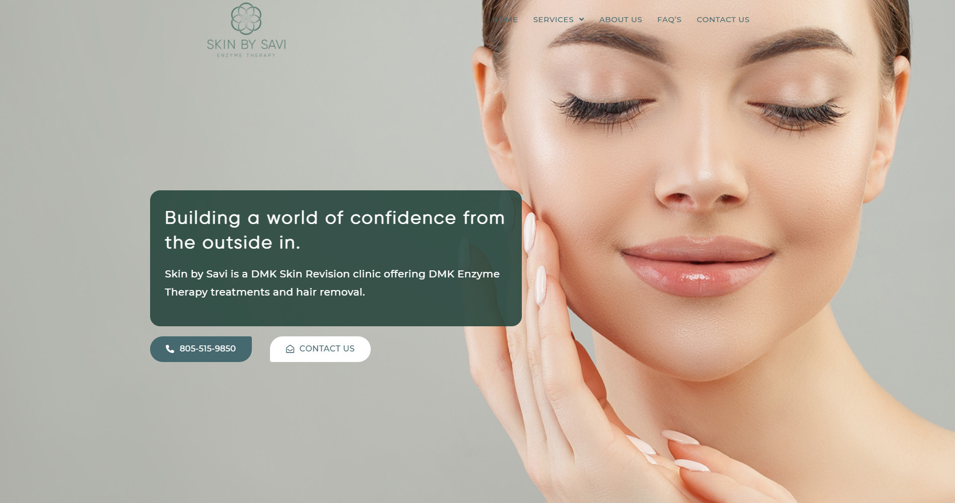
Rich Text Blocks with Supporting Design Elements:
We design text blocks to accomplish the goals of communicating how Skin By Savi can help people, explaining the nuance of the service, and incorporating the visual design philosophy established in the branding kit. This shows all of the planning and design coming together in a tangible website that is working for the client.
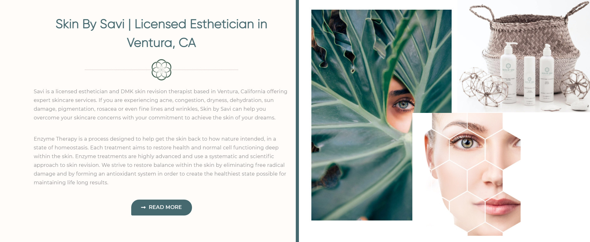
Supporting Visual Aids
On service pages, visual aids are used to help convey concepts and help prospective clients imagine the work that is being done on skin and its importance.
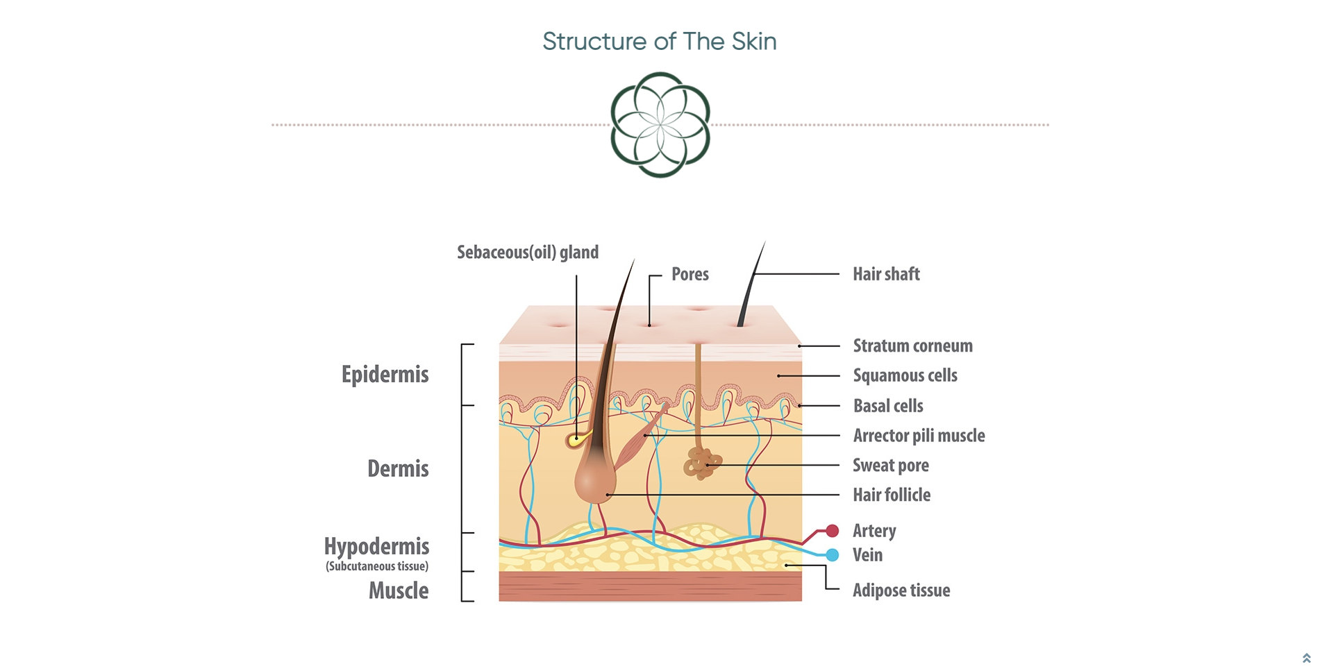
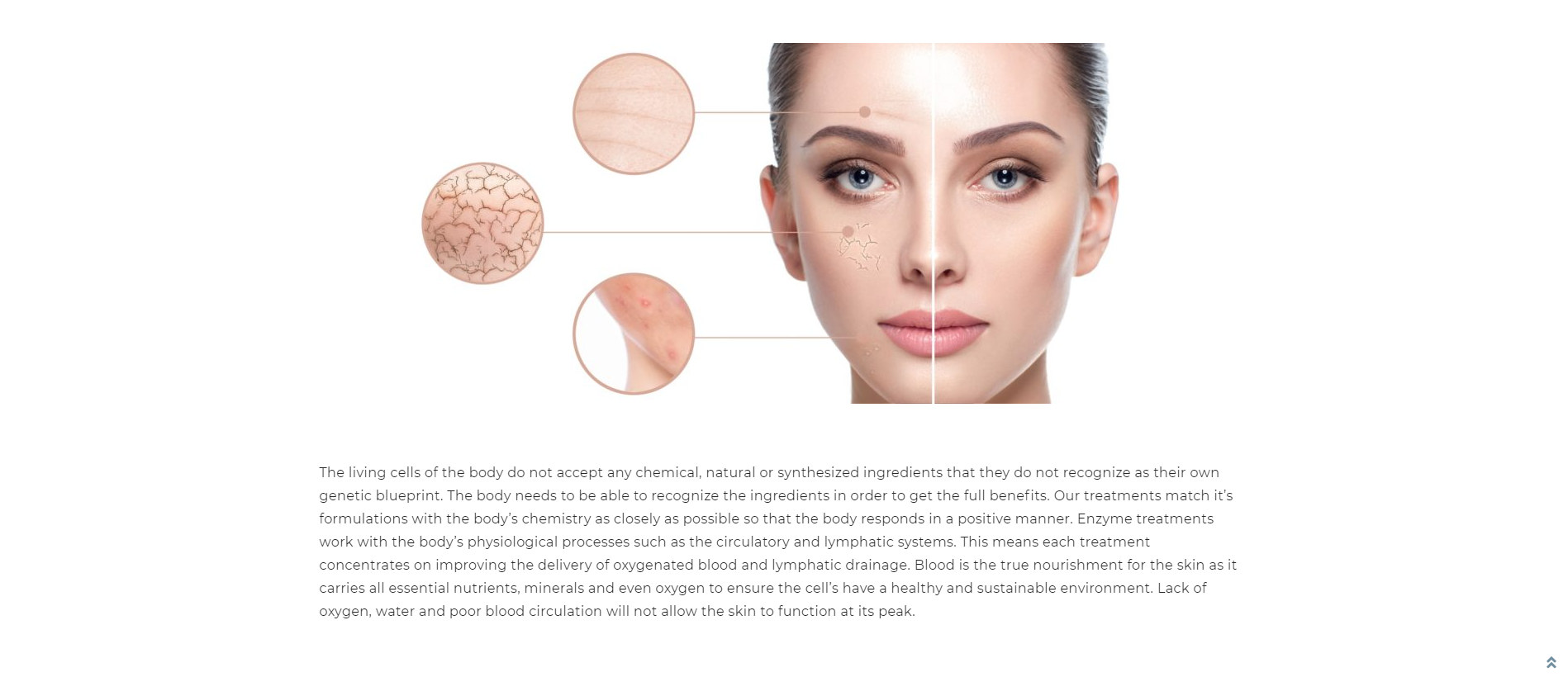
Additional visuals aids used to highlight problems, with accompanying information.
Call to Action Modules
A smart call to action is used on each page that builds trust, shows site visitors how Savanah can solve their problems, and invites them to set an appointment.

Optimizing Website Content for Google Search, and Local SEO
Getting found on Google search results in the Ventura area was a top priority for the client. There is a lot of nuance to the client’s work, and a variety of medical terms and phrases are used that may not be common knowledge to her target clients.
We worked closely with her to develop a plan to get the site ranked on Google. We learned the fine details of her work, and researched the skincare industry at large to understand the kinds of phrases experts use. Then, we used Google’s marketing platform to research the ways that the public searches for skincare services.
For most industries, there are two ways to describe things.
The first way is a very descriptive, accurate, technical way of describing things, known easily by providers and experts, but sometimes not by end users. In the case of Skin By Savi, a good example of this is “Enzyme Therapy Treatments”. That is a core service the client provides.
Often, a company’s target client may not know how to describe what they’re looking for in industry-standard technical terms. This is important to understand, because while Savanah may be technically providing a service known as “Enzyme Therapy Treatments”, when her target clients are searching for a skincare expert, they are more likely to search Google for things like “Skincare expert near me”, or “Esthetician in Ventura, CA”.
So, we went to work researching what people in the Ventura area search for the most when they want to find an expert like Savanah. We reviewed our findings with her, and outlined a mix of the most commonly used “over easy” searches (the searches most likely to help her get new clients), and more descriptive industry terms (the searches likely to be used by people who know exactly what they’re looking for).
These target terms were considered greatly while the content for the site was being created. As the expert in her field, Savannah wrote the website material in a way that would communicate her vision and provide value to her prospective clients. We coached her in how to structure the material so that the site would show up in local Google Searches. We created a writing template, and made a plan where each page has a multi purpose of informing site users about how she can help with their skin, getting ranked in Google Search for a valuable query, and persuading users to book an appointment.
Page heading optimized for Google Searches in Ventura, CA
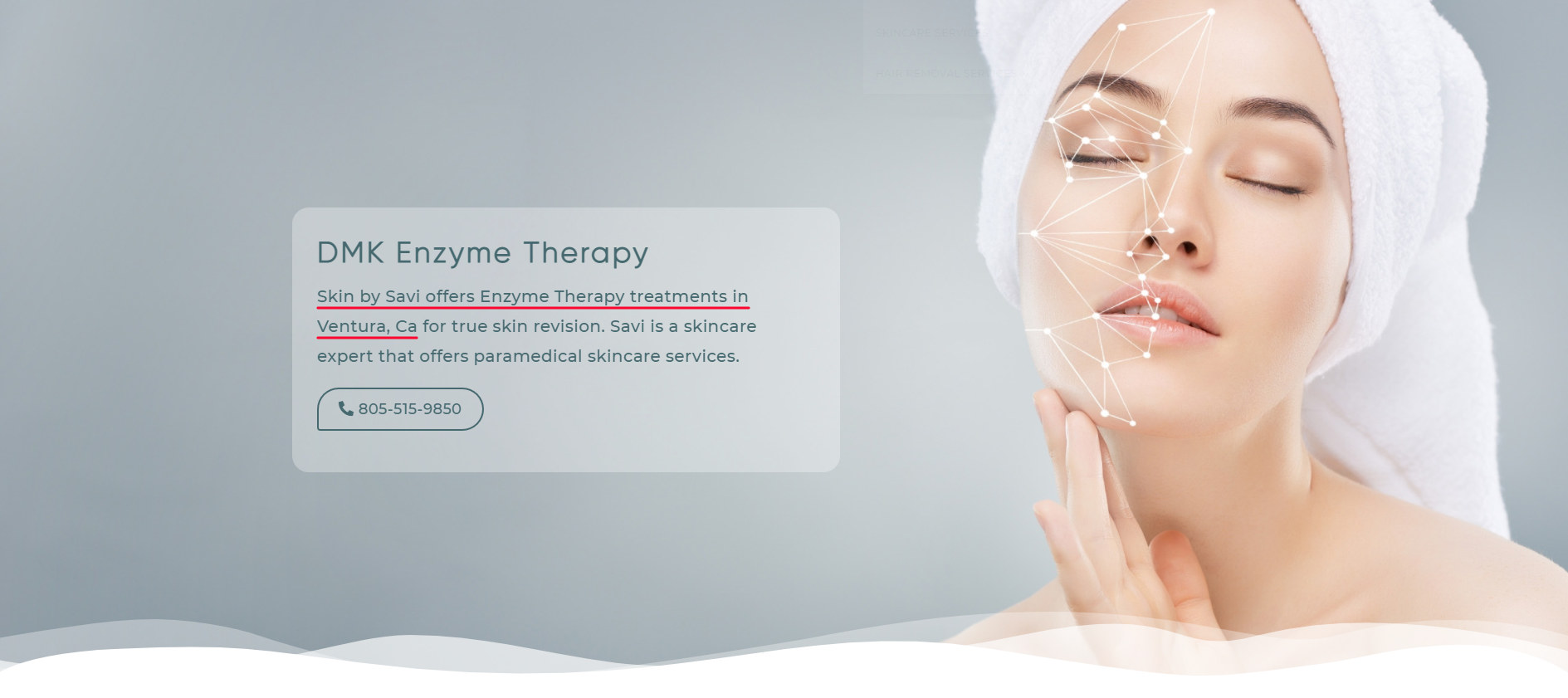
The Results
The result of our collaboration with Savanah is that she now has the perfect digital headquarters to represent her business. Her vision has been executed at every stage, from the fine details of her logo and visual design, to the way her philosophy is communicated. She is excited with the results and feels confident that she has her company’s digital footprint on the right track.
